What if any government had the opportunity to rewrite history, to paste over unflattering narratives and emphasize its purported strengths? I know, unfortunately that isn’t a rhetorical question.
What if 1984, George Orwell’s classic novel about the tyranny of oppression and never-ending surveillance, had been seized and rewritten to promote the work of Oceania, the government in power?

Text version of Figure 1.
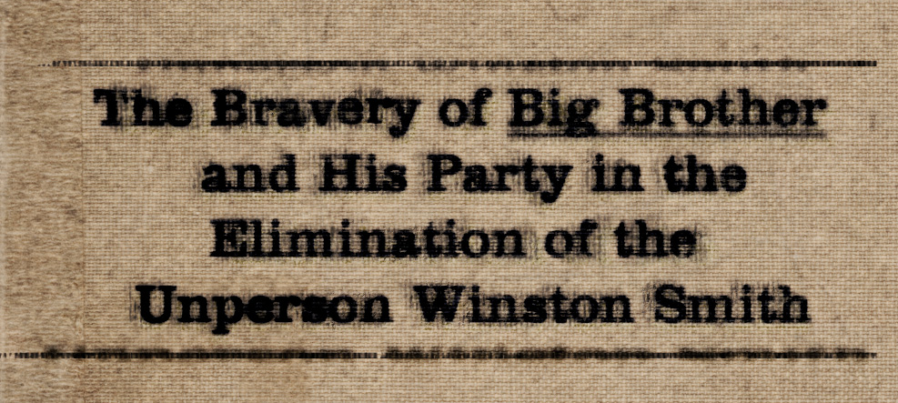
Figure 1. retinart1984
The Bravery of Big Brother
and His Party in the
Elimination of the
Unperson Winston Smith
That’s the premise behind Alexander Charchar’s delicate reworking of the book’s cover art.
“ … That which is hard to ignore, is the fact that it’s ugly. Horribly ugly. It’s centered text to the left, with no thought of kerning or, even though an attempt has been made, to have the lines of text balanced. Perfect for a world where such detail in the arts is ignored and, in a sense, repulsed by those with political muscle …”
Charchar felt that previous cover art was intended to reflect the design sensibilities of the decade (the book has been through so many reprintings, there are dozens of past covers ) rather than the anti-totalitarian message Orwell intended to drive into the reader’s heart and mind.
How would a government like that of Oceania approach its communications with its citizens? As a rough and functional necessity – much like the brutalist approach to architecture?
That certainly strikes a chord if you lived through the second half of the twentieth century, when totalitarian governments in Europe and Asia largely emphasized homogeneity and efficiency over creativity.
It’s also a contrast with the reality we face today, where governments continually experiment with nuanced and targeted messages designed to build support for increased security and ever more invasive surveillance measures.

