

Office of the Privacy Commissioner of Canada Sweep Report 2024: Deceptive Design Patterns
Background
The Office of the Privacy Commissioner of Canada (OPC) coordinated and participated in this year’s Global Privacy Enforcement Network (GPEN) Sweep on deceptive design patterns, or “dark patterns”, along with 25 other privacy enforcement authorities from around the world. GPEN is an informal network of Privacy Enforcement Authorities, which supports information sharing, capacity building and cross-border cooperation on matters related to enforcement. Because of the mutual relevance of deceptive design patterns to both privacy and consumer protection, the Sweep was conducted for the first time in coordination with the International Consumer Protection and Enforcement Network (ICPEN).
Deceptive design patterns are used on websites and mobile apps to influence, manipulate, or coerce users to make decisions that are not in their best interests.Footnote 1 They can prevent users from making informed decisions about the collection, use, and disclosure of their personal information, and cause them to give up more privacy than they would like. Deceptive design patterns can be used either on their own or in conjunction with one another. When two or more deceptive design patterns are used together, they can become more effective at influencing users’ privacy decisions. The use of one deceptive design pattern may also facilitate downstream uses of other patterns.
OPC “sweepers” examined 145 websites and appsFootnote 2 accessible in Canada across various sectors, such as retail, social media, news, and entertainment, as well as websites and apps that appear to be aimed at children.Footnote 3
The OPC looked for five specific deceptive design patterns, based on criteria set out by the Organisation for Economic Co-operation and Development (OECD):
1. Complex and confusing language
technical and/or excessively long privacy policies that are difficult to understand;
2. Interface interference
design elements that can influence users’ perception and understanding of their privacy options;
3. Nagging
repeated prompts for users to take specific actions that may undermine their privacy interests;
4. Obstruction
the insertion of unnecessary, additional steps between users and their privacy-related goals; and
5. Forced action
requiring or tricking users into disclosing more personal information to access a service than is necessary to provide that service
Further explanations, results, and examples of these patterns are included below.
Summary of Key OPC Observations
OPC sweepers found deceptive design patterns in almost all of the 145 websites and apps examined: 99% of websites and apps reviewed contained at least one indicator of deceptive design (compared to 97% of the global GPEN result).Footnote 4
The most common type of deceptive design pattern observed was complex and confusing language in privacy policies. Sweepers found that in 96% of the cases (89% globally), the privacy policies on websites and apps were either excessive in length (over 3,000 words) or used technical and confusing language, making them difficult to read and understand. Specifically, OPC sweepers found that 33% of privacy policies were very difficult to read (compared to a global average of 20%). In addition, the privacy policies reviewed were found to be very long (76% were over 3,000 words, compared to a global result of 55%).
Sweepers also identified frequent use of the deceptive design patterns of obstruction and interface interference.
Sweepers found that a substantial proportion of websites and apps used obstruction and created obstacles between users and their goals, potentially dissuading them to make their intended choices. Specifically, in attempting to delete accounts, on only 25% of websites and apps were OPC sweepers able to find the option to delete their account in two clicks or fewer (compared to a global result of 17%). In addition, for 43% of websites and apps reviewed, sweepers could not find the option to delete their account at all (compared to 55% for the global result).
Sweepers also found that a significant proportion of websites and apps employed interface interference that encouraged users to accept less privacy-protective options. More specifically, 65% of websites and apps that provided users with upfront privacy choices had the least privacy-protective options selected by default (compared to the global result of 48%). OPC sweepers encountered visual elements that channel users towards less privacy-protective setting options in a similar number of cases (65%, compared to a global result of 57%).
The deceptive design practices that sweepers encountered hinder users from making informed decisions about their personal information, and often serve the interests of the platform.
The following is a sectoral breakdown of the websites and mobile apps examined in the OPC Sweep:
Sectoral breakdown of websites and mobile apps
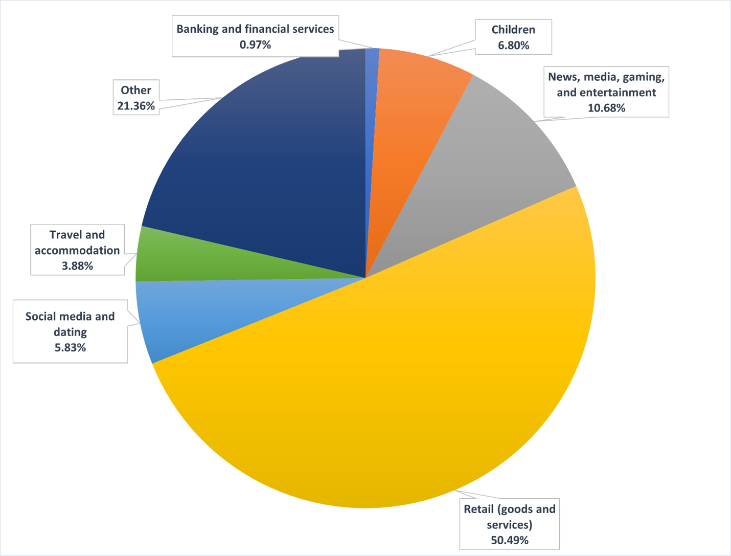
Text version of Figure 1
| Sector | Pourcentage |
|---|---|
| Banking and financial services | 0.97% |
| Children | 6.80% |
| News, media, gaming, and entertainment | 10.68% |
| Retail (goods and services) | 50.49% |
| Social media and dating | 5.83% |
| Travel and accommodation | 3.88% |
| Other | 21.36% |
OPC Sweep Results
Below, we will discuss the OPC’s sweep results, observations and examples in relation to each of the five types of deceptive design patterns (or indicators) that sweepers looked for in their engagements with websites and apps.
Complex and Confusing Language (Indicator 1)
The GPEN Sweep examined the accessibility of privacy policies, looking at how often websites and apps rely on highly complex and confusing language. Long and confusing privacy policies make it difficult for users to make privacy-protective decisions.
Complex and confusing language in privacy policies was the most common deceptive design pattern encountered by sweepers, occurring in 96% of cases (compared to 89% globally).
Generally, OPC sweepers found the privacy policies easily. For 52% (compared to 59% globally) of the websites and apps examined, sweepers were able to find the privacy policy in a single click, and 76% of privacy policies could be found in two clicks (compared to 73% globally).
However, when OPC sweepers found those privacy policies, they were often very long: 76% were over 3,000 words (compared to a global average of 55%). Moreover, based on the Flesch Reading Ease score, 83% of the privacy policies swept by the OPC were found to be difficult to read, requiring either a university or graduate education reading level, compared to 76% globally.Footnote 5
Readability of privacy policies
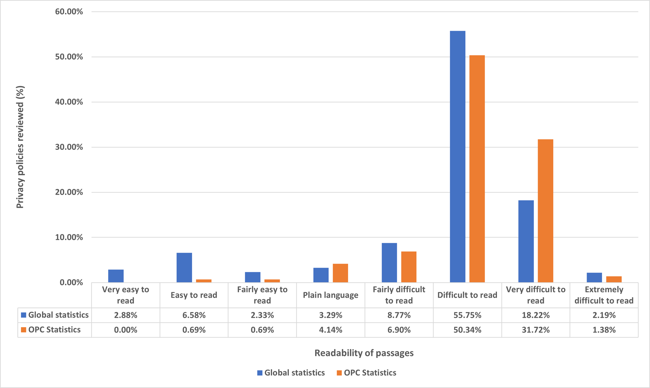
Text version of Figure 2
| Readability of passages | Global statistics | OPC statistics |
|---|---|---|
| Very easy to read | 2.88% | 0.00% |
| Easy to read | 6.58% | 0.69% |
| Fairly easy to read | 2.33% | 0.69% |
| Plain language | 3.29% | 4.14% |
| Fairly difficult to read | 8.77% | 6.90% |
| Difficult to read | 55.75% | 50.34% |
| Very difficult to read | 18.22% | 31.72% |
| Extremely difficult to read | 2.19% | 1.38% |
Writing content at a reading level above grade 8 can make it difficult for many people to understand.Footnote 6 A university level education should not be a prerequisite for understanding an organization’s privacy policy. Websites and apps need to better communicate their privacy policies, in plain language, so that users can make informed decisions about how their personal information will be collected, used, and disclosed.
Interface Interference (Indicator 2)
OPC sweepers often encountered interface interference design patterns, which are distracting and/or conflicting elements in an interface that result in disruption or confusion for the user. The Sweep examined three types of interface interference: false hierarchy, preselection, and confirm-shaming.
False Hierarchy
A false hierarchy emphasizes certain visual elements and obscures others, to channel users towards less privacy-protective options. For instance, it can make certain choices larger, more colourful, and bold (e.g., “ACCEPT ALL”), while making the most privacy protective option smaller, dull, and muted (e.g., “reject all”). By placing the less privacy-protective option at the front and centre of the screen or making the more privacy-protective option less visible (or not visible at all without scrolling down the page), false hierarchies play with space to make it easier for users to select the least privacy protective option.
During their review, OPC sweepers found that when registering or deleting an account, 24% of websites and apps displayed a false hierarchy (compared to a global average of 31%).
Furthermore, when reviewing privacy settings, sweepers encountered the false hierarchy phenomenon in 65% of websites and apps swept (compared to 57% globally).
Here is an example from Prada’s website:
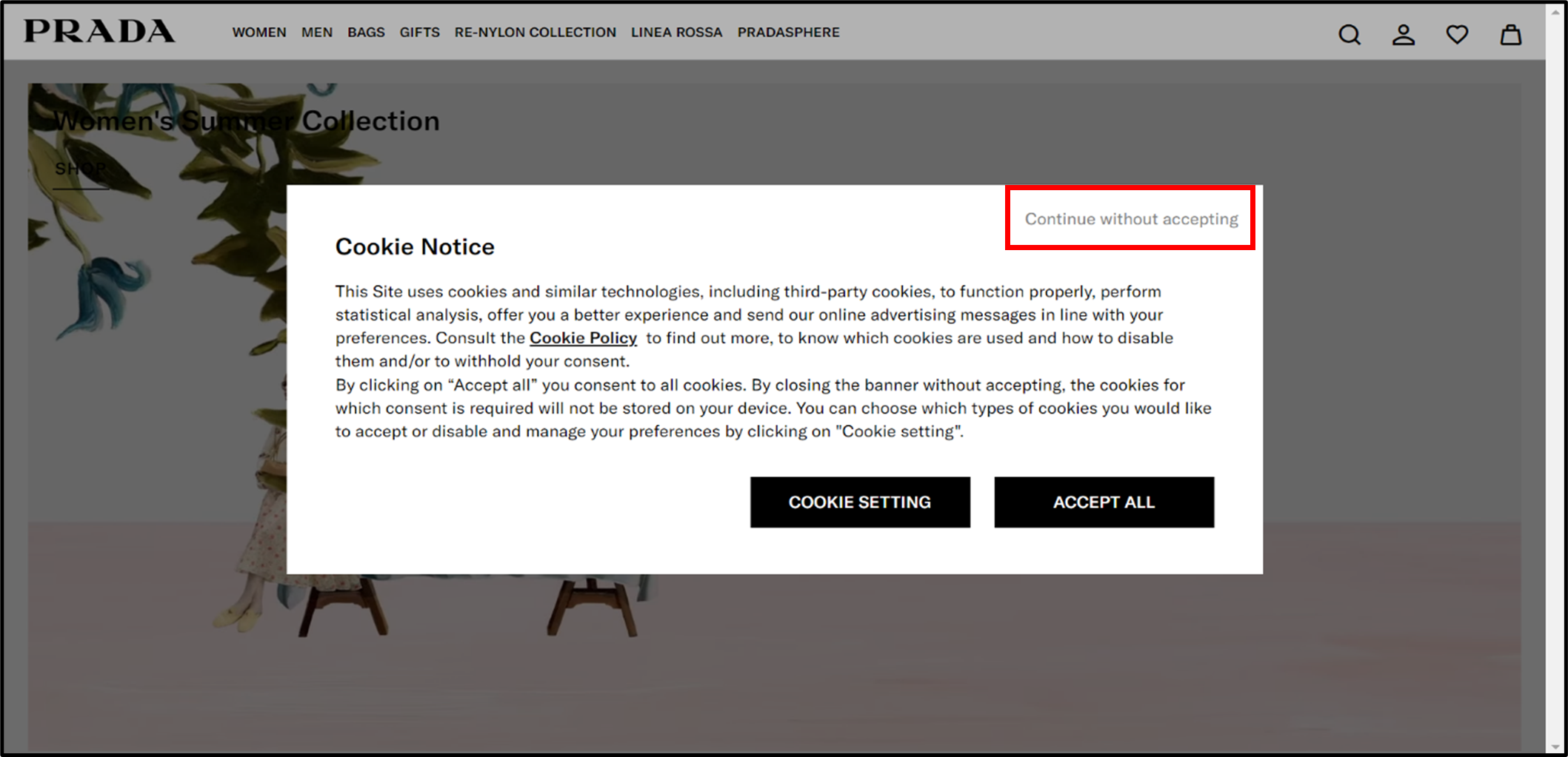
The website cookie notice for Prada contains two large black boxes inviting users to either adjust their “COOKIE SETTING” or simply “ACCEPT ALL” cookies. The option to “continue without accepting” cookies is in a less obvious area, and in light grey font against a white background. The notice thus makes the most privacy protective option the hardest to see.
Websites and apps should be designed to ensure that privacy-protective choices related to privacy are, at least, equally visible; no one should have to squint to find out how to protect their personal information.
Preselection
With this deceptive design pattern, the most privacy intrusive option is preselected by default. While users can still click on other options, many will simply click to accept preselected choices because it is the easiest choice.
With respect to privacy settings, 65% of the apps and websites swept preselected the less privacy-protective choice (compared to the global average of 48%).
Consider the following example of a potentially privacy-invasive option being pre-selected on La-Z-Boy’s website:
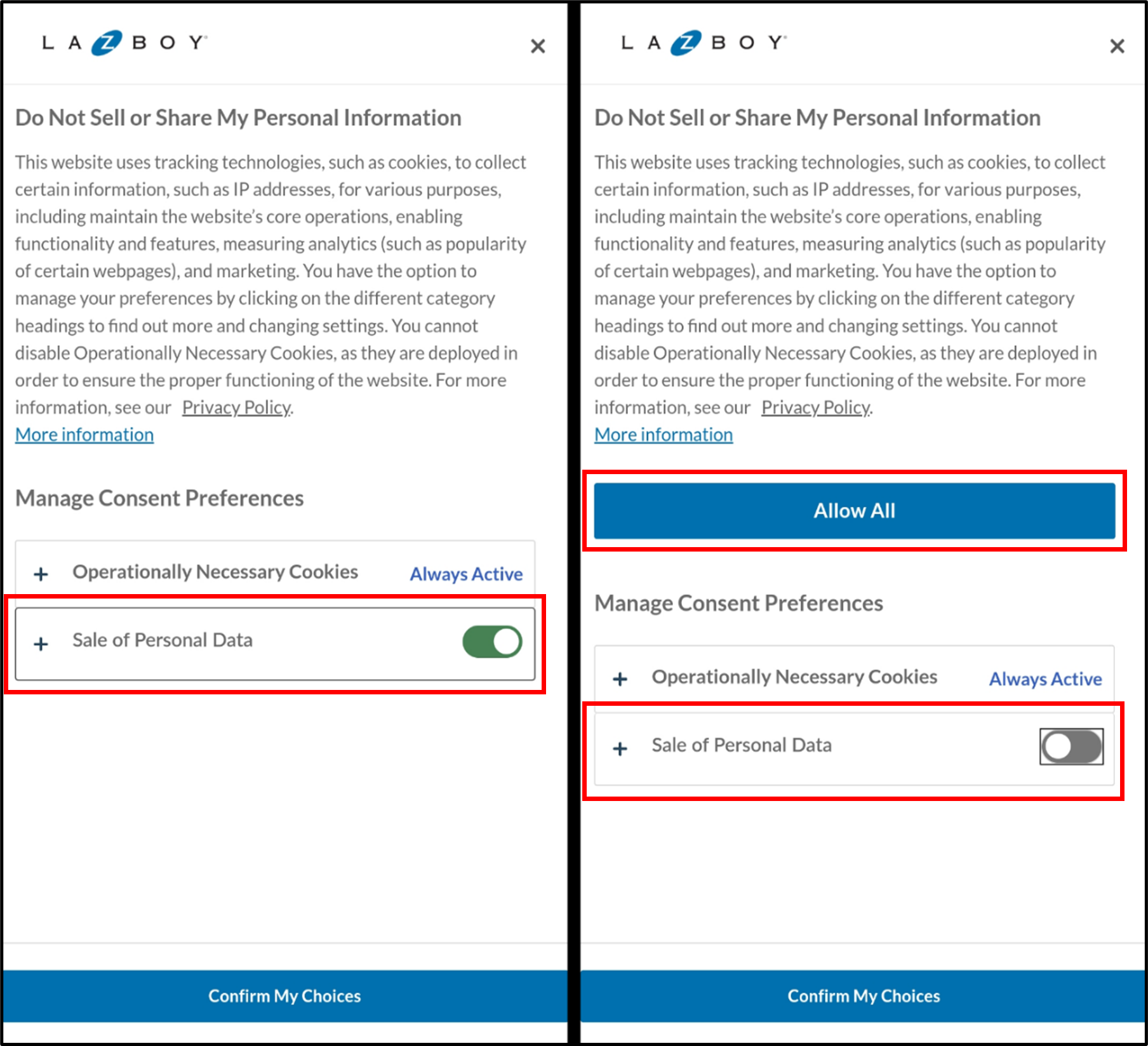
Deceptive design patterns are often found in combination. The above illustration is also an example of Confusing Language (explained under Indicator 1), whereby the title of the image may mislead users into thinking that the preselected choice is more privacy-protective – despite the heading “Do Not Sell or Share My Personal Information,” the image on the left shows that, by default, La-Z-Boy may indeed sell users’ personal information unless they take action to opt out.
As shown on the illustration, this website also leverages a False Hierarchy. When users deselect the “Sale of Personal Data” toggle, a new large “Allow All” button appears in the middle of the screen. This button is similar to, but more prominent than the “Confirm My Choices” button, that looks like a footer at the bottom of the screen. This design could cause users to accept all cookies by accident, contrary to the choice they intend. Furthermore, it is not clear why the “Allow All” option pops up at all in response to a user who has just expressly chosen to deselect one of the choices.
Even where the law allows opt-out consent, organizations should consider preselecting the most privacy protective options by default or requiring users to make an active choice as to whether they want to consent.
Confirm-Shaming
Confirm-shaming uses emotionally charged language to push users towards options favoured by the organization. When deleting an account, users might encounter expressions like, “It would be a shame to see you go!,” or, when being asked to register, users might be asked to close a window that says, “No thanks, I’m not into savings.”
For example, confirm-shaming came up for 20% of websites and apps when sweepers tried to delete an account (compared to a global average of 29%).
Consider the following example of confirm-shaming from Sephora:
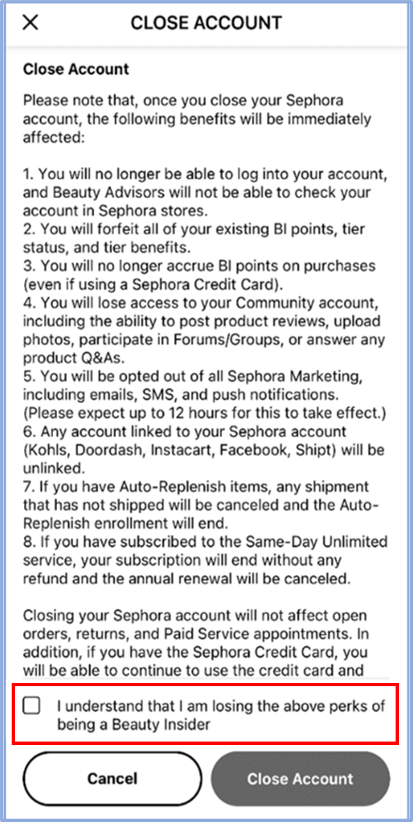
Sephora rightly informs users of the consequences of closing their account. However, by framing these consequences as “losing” a long list of “perks”, the app deploys emotionally charged language that may influence the user’s decision.
Websites and apps should present privacy-related decisions in neutral language. After all, for many, protecting privacy is just as much a “perk” as potential savings.
Nagging (Indicator 3)
Nagging is a deceptive design pattern that involves repeatedly sending users the same prompts or requests. The goal is to annoy users into taking actions they would not normally take, like signing up for an account, providing their email address on a website or app, and/or downloading or switching to a mobile app version, which will result in greater collection of personal information.
On average, OPC sweepers encountered nagging in 15% of interactions on swept websites and apps (compared to a global average of 14%).Footnote 7
However, when it came specifically to account registration and deletion, sweepers found that 30% of websites and apps engaged in nagging (compared to a global average of 35%).
Consider the following example of nagging on LinkedIn's website and app:
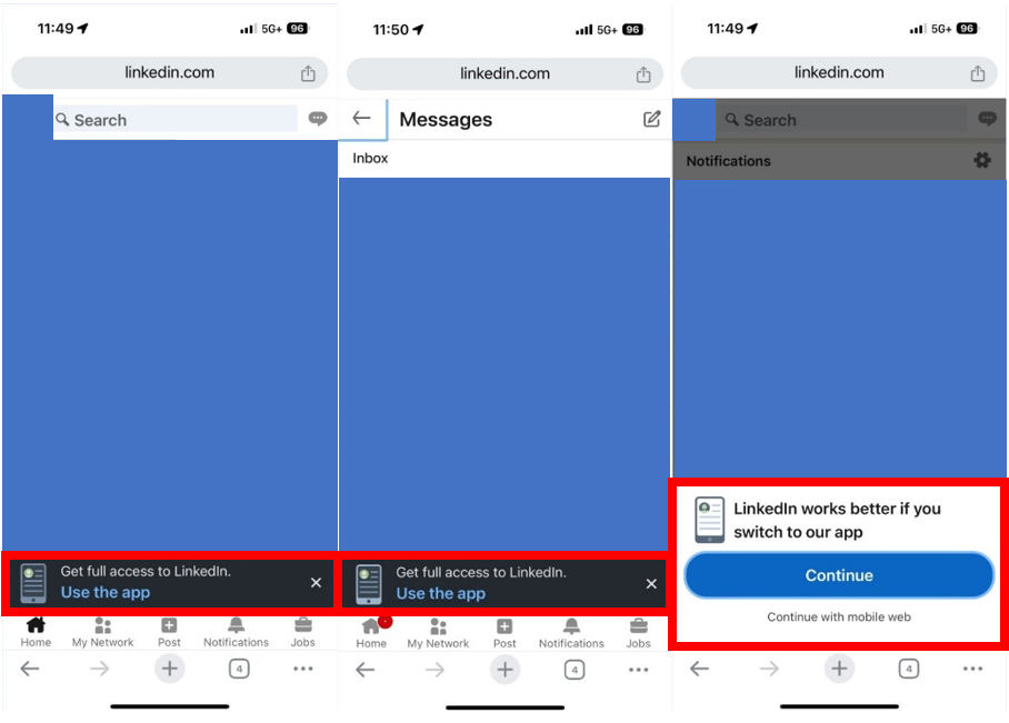
OPC sweepers noted that LinkedIn employs nagging to encourage users to download its app. The app can enable the collection and use of more personal information than the website, such as GPS real time location, access to phone contacts, and access to camera and microphone for messaging. In this instance, the patterns of nagging involve repeated prompts that disrupt the user’s experience and nudge them towards using the app instead of the mobile browser version of the website (highlighted in the red boxes above).
For example, LinkedIn’s website presents a persistent banner at the bottom of the screen, urging users to “Get full access to LinkedIn” by using the app. The banner is present across various pages, like messages and posts, and although users may close the banner while browsing the page they are on, it reappears if they select a different page.
Sweepers found a variation of nagging on the notifications tab on LinkedIn’s website, where users are presented with a bold, contrasting ‘Continue’ button. This is coupled with a demonstration of false hierarchy, where the more privacy protective option, ‘Continue with mobile web,’ is presented in faint grey underneath and in a significantly smaller font.
The use of nagging such as this can erode user trust in, and the credibility of, the website or app in question.
Obstruction (Indicator 4)
Obstruction is a deceptive design pattern that makes certain actions – such as finding privacy settings or deleting an account – difficult to accomplish, thereby discouraging users from completing them. A common type of obstruction is “click fatigue”, which requires users to take an unreasonable number of steps to achieve a specific goal, potentially frustrating them into giving up on, or acting against, their intentions, which may not be in their best interests.
On average, OPC sweepers encountered obstruction in 36% of interactions on websites and apps swept (compared to a global average of 39%).
Specifically, in attempting to delete accounts, on only 25% of websites and apps were OPC sweepers able to find the option to delete their account in two clicks or fewer (compared to a global result of 17%).
In addition, sweepers found that 43% of the websites and apps required users to take additional steps to delete their account (compared to a global average of 27%).
Consider the following example on Ticketmaster’s website:
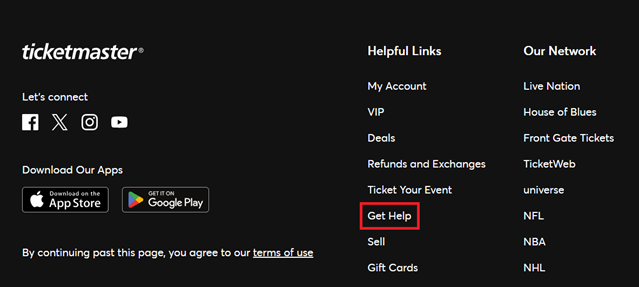
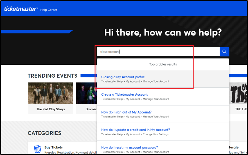
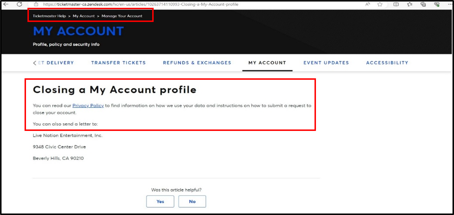
Users who click on this link will be taken to a page where they are presented with a physical address to which they can send a letter to close their account (an email address is not provided) and a link to the privacy policy, where it states they can find “instructions on how to submit a request to close your account.” However, nowhere in the privacy policy does Ticketmaster explicitly address how users can actually close their account. In fact, we could not find the word “close” anywhere in that policy. At the bottom of the page at Figure 9, Ticketmaster asks “Was this article helpful?” The answer seems to be “No”.
Forced Action (Indicator 5)
Forced action is a deceptive design pattern that requires users to complete a specific action on the website or app to achieve their objective. This can include, for example, forcing users to disclose personal information by signing up for an account when the website or app does not actually require that information to function, or making users provide additional information before they can delete their account. The deceptive design pattern limits users’ ability to manage their personal information.
On average, OPC sweepers encountered forced action designs in 16% of interactions on the websites and apps they swept (compared to the global average of 21%).
The sweepers also found that 22% of the websites and apps had no other option than to “accept” or “accept all” with regard to privacy settings and cookies (compared to a global average of 26%).
The following is an example where more information is required to delete an account than was required to create one on Burger King’s website:
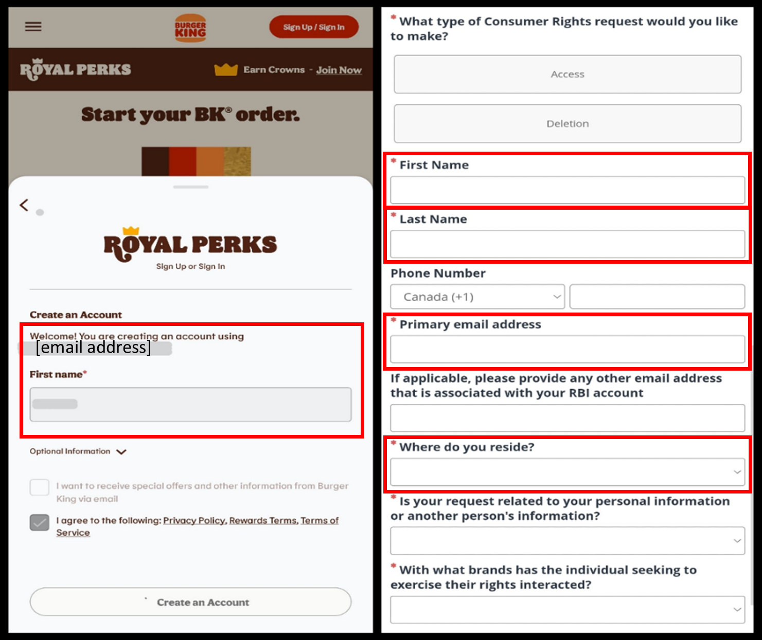
When a user registers for an account with Burger King, they are only required to provide an email address and first name (or they can register through a third-party, like Google or Facebook). However, if the user wants to delete their account, they are forced to disclose personal information that they were not required to provide initially, including where they live.
Below is another example of forced disclosure that users encounter when they try to create an account on Zara’s website:
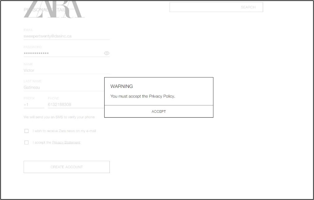
When a user attempts to create an account on Zara and does not click the checkbox beside “I accept the Privacy Statement,” they encounter a pop-up stating: “WARNING / You must accept the Privacy Policy.” The pop-up does not provide users with an option to change their mind about creating an account. In fact, it blocks users from doing anything on the website except clicking the “ACCEPT” button and users cannot even click on the privacy statement to read it. Users are thus forced to agree to terms that they cannot read, potentially disclosing more personal information than they would like, which may not be in their best interests.
Use of Deceptive Design Patterns on Websites and Apps that Appear to be Aimed at Children
Background
The OPC collaborated with the Office of the Information and Privacy Commissioner of Alberta (OIPC-AB) and the Office of the Information and Privacy Commissioner for British Columbia (OIPC-BC) to examine the use of deceptive design patterns on websites and apps that appear to be aimed at children (“children’s websites and apps”). Collectively, the three offices examined 67 children’s websites and apps, which are the basis for the findings and statistics below.
The OPC has identified “Championing children’s privacy rights” as one of three strategic privacy priorities to guide its work from 2024 through 2027. The OIPC-AB likewise has made it a strategic priority in its 2024-2027 business plan to “identify, facilitate and support opportunities to enhance access and privacy education and protections for children and youth.” In the context of this sweep, the OIPC-BC focused on websites targeting children to further its commitment to promoting and protecting the privacy rights of young people. That commitment has included calling for a Children’s Code, which would bolster guidance to businesses on safeguards for handing the data of young people that address the specific challenges and unique harms youth face when they engage online. On October 4-5, 2023, our three offices, along with other provincial and territorial Privacy Commissioners and Ombuds, also signed a joint Resolution: Putting best interests of young people at the forefront of privacy and access to personal information.Footnote 9
While we might expect that parents make most privacy decisions for children, research has shown that parents do not always have a good understanding of their children’s online activities, and many underestimate the amount of time their children spend on devices.Footnote 10 In other words, children may be navigating websites and apps without their parents’ knowledge, leaving them particularly vulnerable to deceptive design patterns.
Summary of Key Observations
Canadian sweepers from the three Offices found that specific deceptive design patterns, such as false hierarchy, confirm shaming, and nagging, occurred significantly more often on children’s websites and apps than on those that appear to be aimed at the general population.Footnote 11
- With respect to the creation or deletion of an account, sweepers found that 56% of children’s websites and apps displayed a false hierarchy by making the option to sign up for the service more prominent than the option to continue without an account (vs. 24% for other websites and apps).
- Similarly, on 54% of the children’s websites and apps reviewed, sweepers encountered confirm-shaming, i.e., charged language that may dissuade users from deleting their accounts (vs. 17% for other websites and apps).
- On average, sweepers encountered some form of nagging on 45% of interactions on the children’s websites and apps swept, whereby they were repeatedly confronted with the same prompts or requests (three times as many as they encountered for other websites and apps, 15%).
Children and young people, who may not grasp the consequences of agreeing to the collection, use or disclosure of their personal information, are particularly vulnerable in the digital world. It is therefore important that parents be able to easily make informed decisions about practices related to their children’s personal information online.
Case Studies
As the statistics above indicate, we found many examples of deceptive design patterns in the 67 children’s websites and apps swept. We did, however, also find some examples of good design patterns that might help protect children’s privacy. The “Case Studies” below are intended to be illustrative of certain concerning, and encouraging, practices encountered during the sweep of children’s websites and apps.
Case-Study: Poki Games
Poki Games, a website that hosts free online games, exemplified some of the most common deceptive design patterns that we found on children’s websites and apps.
As shown below, there are two versions of the website, Poki.com and kids.poki.com (“Poki Kids”):
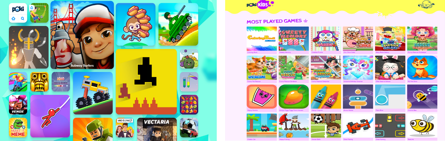
While Poki Kids is explicitly aimed at children, the Poki.com privacy policy states: “If you are under the age of 16, this website is not meant for you.” However, there is no indication anywhere on the homepage that the website is intended for users 16 and older. In fact, the various colourful images of games displayed, with names such as “Monkey Mart” or “Rainbow Obby”, would appear to be aimed at children much younger than 16 (see the left side of Figure 12 above).
As a result, in our view, many young children are likely to use Poki’s 16+ website. In this context, sweepers identified certain deceptive design patterns of particular concern.
False hierarchy
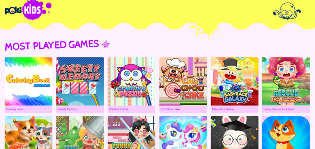
First, Poki Games deploys a false hierarchy by making the more privacy-protective option less prominent than continuing on the 16+ website. To find the link to Poki Kids (which claims to collect significantly less personal information, employing no tracking cookies), users must click on a link in small grey font at the bottom of the poki.com webpage. We find it likely that very few users will scroll through multiple pages (more than 20 screens on the mobile site) and past dozens of colourfully attractive video games, to find the “Poki Kids” option (See Figure 13 below).

Similarly, few users are likely to find, let alone read, the Privacy Statement (which can be found next to Poki Kids at the bottom of the page) to learn that Poki Games is, contrary to appearances, intended for users aged 16 or older. Users would therefore have no reason to even look for the “kids” version of the website.
Moreover, older children who navigate their way to Poki Kids will find games that appear to be designed for very young children (see Figure 14, below), and may be tempted to return to the 16+ site, which could result in Poki Game’s collection of their personal information.
Preselection
In the bottom right corner of the homepage (see Figure 15 below), Poki Games prompts users during their first visit to the website to consider their cookie settings. It is generally a good practice for websites and apps to immediately encourage first-time users to consider how their personal information will be collected, used, and disclosed. However, as explained above, this website is likely to be frequented by children, and even young children (under the age of 13). We are therefore concerned that those younger users are unlikely to delay their gameplay to visit Poki Game’s “Privacy Center”. Even if they did, they are unlikely to understand the privacy-related decisions that Poki Games is asking them to make or to seek parental support to assist them in their privacy decisions before they can start playing (see Figure 15 below).
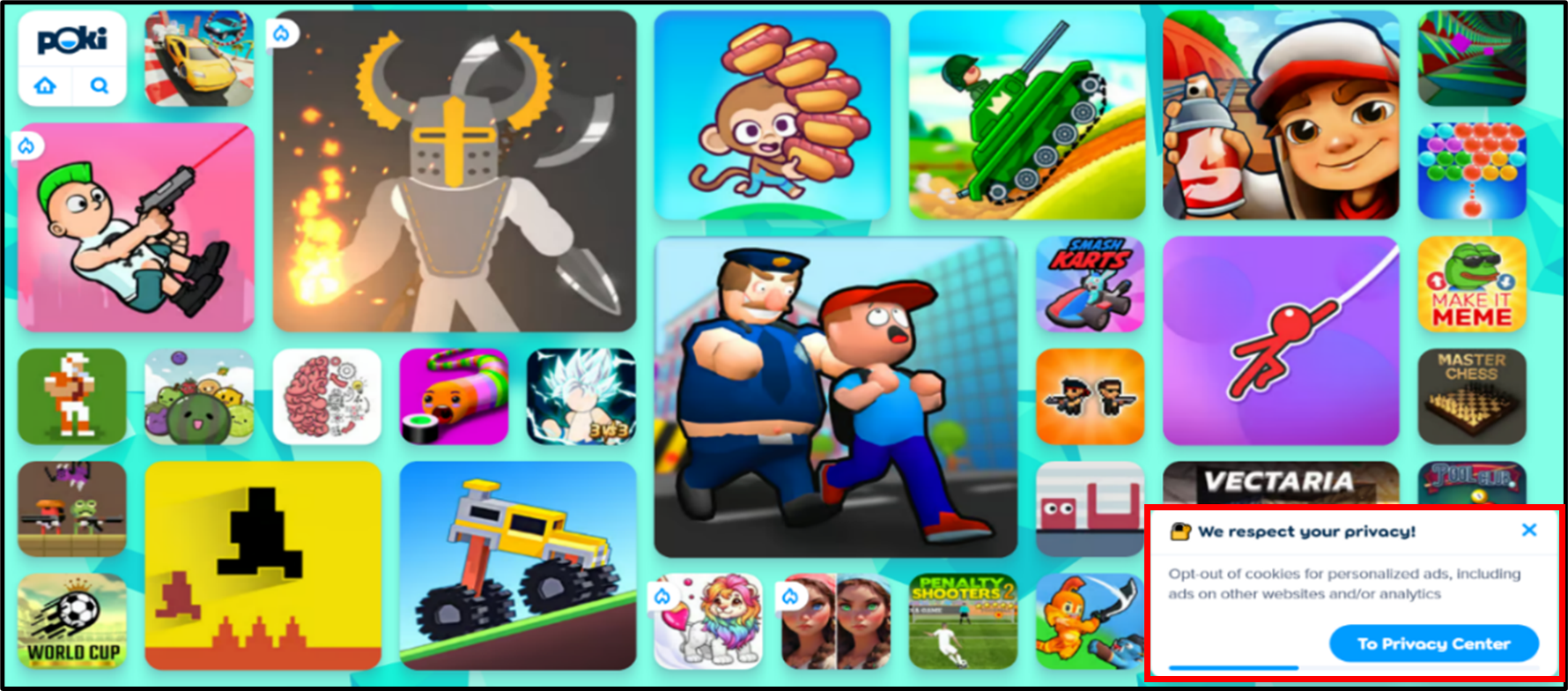
Moreover, even if a user who is 16 years or over were to be on this site and clicked on the link to visit Poki Game’s “Privacy Center,” they would find that each of the least privacy protective options is selected by default.
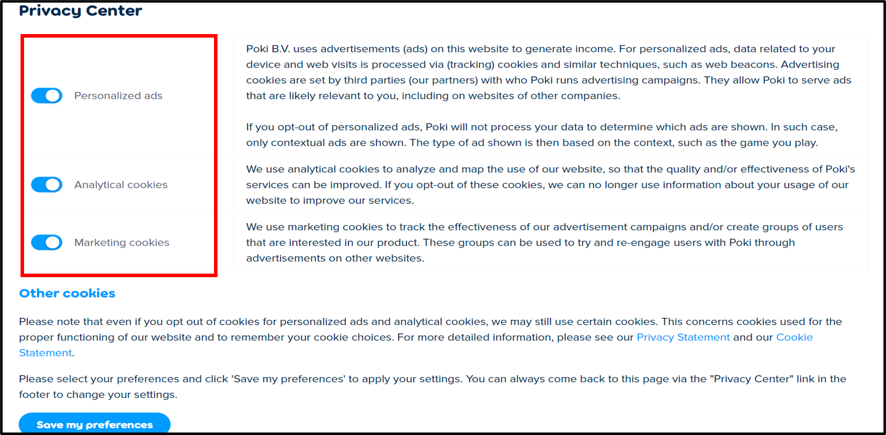
This is an example of the deceptive design pattern of preselection. In Figure 15, if users do not click on the “To Privacy Center” button in the privacy prompt, or if they do click on the “X” in the top right corner of the prompt, the least privacy protective options will remain enabled.
Furthermore, users who do choose to visit the Privacy Center will be required to read three separate explanations and make three separate decisions, without the option to simply “turn off all cookies”, or even “turn off all but necessary cookies”.
Ultimately, given that the website appears to be directed at young children, and likely to be attractive to children, it is particularly troubling that tracking (for purposes including the delivery of personalized ads) is used on this site at all, let alone set to “on” by default, which puts young visitors to the website at risk of inappropriate tracking.
Designers need to be mindful that their websites and apps may be attractive to or of interest to children. Where that is the case, they should make extra efforts to eliminate deceptive design patterns. It is not enough for organizations to have their websites or apps state in a privacy policy that the platform is not meant for children; the platform should also be designed in a way to minimize the likelihood of tracking and targeting children, as well as assist parents/guardians in making informed decisions about the protection of their children’s personal information.
Case-Study: Lego
Sweepers found certain positive design elements incorporated into Lego’s websites.
As displayed in the examples below, Lego provides both parents and guardians, as well as children, with opportunities to learn about its privacy policies and better understand its collection and use of their personal information.
First, we note that the privacy policy on Lego.com (the Official Lego Shop) has distinct sections for parents and children (see Figure 17 below):
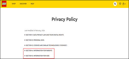
The information for parents and guardians is presented in language at a grade 12 reading level, according to the Flesch Reading Ease Score,Footnote 12 which is easier to read than the vast majority of the website and app privacy policies that Canadian sweepers reviewed (83%). The “information for parents” section explains, in a well organized and easy to navigate format, how the website collects and uses children’s personal information, as well as the actions that parents or guardians can take to protect their children’s privacy.
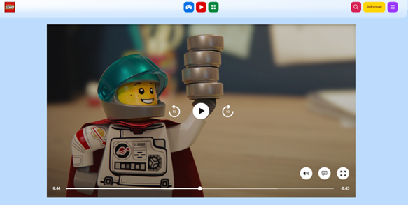
The “information for kids” section of the Lego.com privacy policy includes a link to a short, child-friendly video about Lego’s privacy policies on kids.lego.com, a site where kids can play online games. Similarly, children or parents/guardians who visit kids.lego.com will find a link to the privacy policy at the bottom right-hand corner of the screen, without needing to scroll past the various games presented on the page. That link takes the user directly to a video, featuring “Captain Safety”. The video provides children with information about Lego’s privacy practices and its use of cookies, in a creative and accessible way, and encourages children who have further questions to talk to their parents or rewatch the video with them (see Figure 18 below):
Ultimately, where a website or app is likely to be appealing to children, organizations should avoid or minimize the collection of personal information from users. In circumstances where it is necessary and appropriate to collect personal information from children, they should present privacy information to children in a format and language that is accessible to them, and design their website and app in a way that will allow parents to easily make informed choices to protect their children’s privacy.
Conclusion
Sweepers found that deceptive design patterns were extremely common on websites and apps, whether targeted at children or adults.
For some of the indicators, Canadian sweepers found a higher incidence of deceptive design patterns compared to the global results. For example, OPC sweepers were more likely to encounter complex and long privacy policies, less privacy protective options selected by default, as well as visual elements that prompt users to make less privacy protective choices.
Canadian sweepers also encountered significant obstruction. For example, they were unable to find the option to delete their account on almost half of the websites and apps examined (where there was an option to create an account).
While it is important for organizations to avoid deceptive design patterns on their websites and apps so that users can make informed privacy choices free of manipulation, the OPC, OIPC-AB and OIPC-BC wish to emphasise that it is particularly crucial to ensure privacy-protective design by default for websites and apps that may be appealing to children. That said, design that emphasises the importance of privacy ensures that the protection of personal information is built into the website or app, regardless of the age of the user.
Websites and apps aimed primarily at children should implement the most privacy-protective settings by default and encourage children to talk to their parents/guardians to help them make privacy decisions. Similarly, parents/guardians should be able to easily make informed privacy decisions about their children’s personal information on websites and apps.
Unfortunately, the OPC found deceptive designs patterns to be just as frequent, and at times even more frequent, on children’s websites and apps. We therefore strongly encourage the operators of websites and apps to review this report (along with the overarching GPEN Sweep Report) and assess their platform interface design to reduce deceptive design patterns like obstruction, interface interference, and nagging. Ensuring that privacy is respected and protected by design will create a safer online environment for everyone, especially children, and increase individuals’ trust in the global digital environment.
- Date modified: